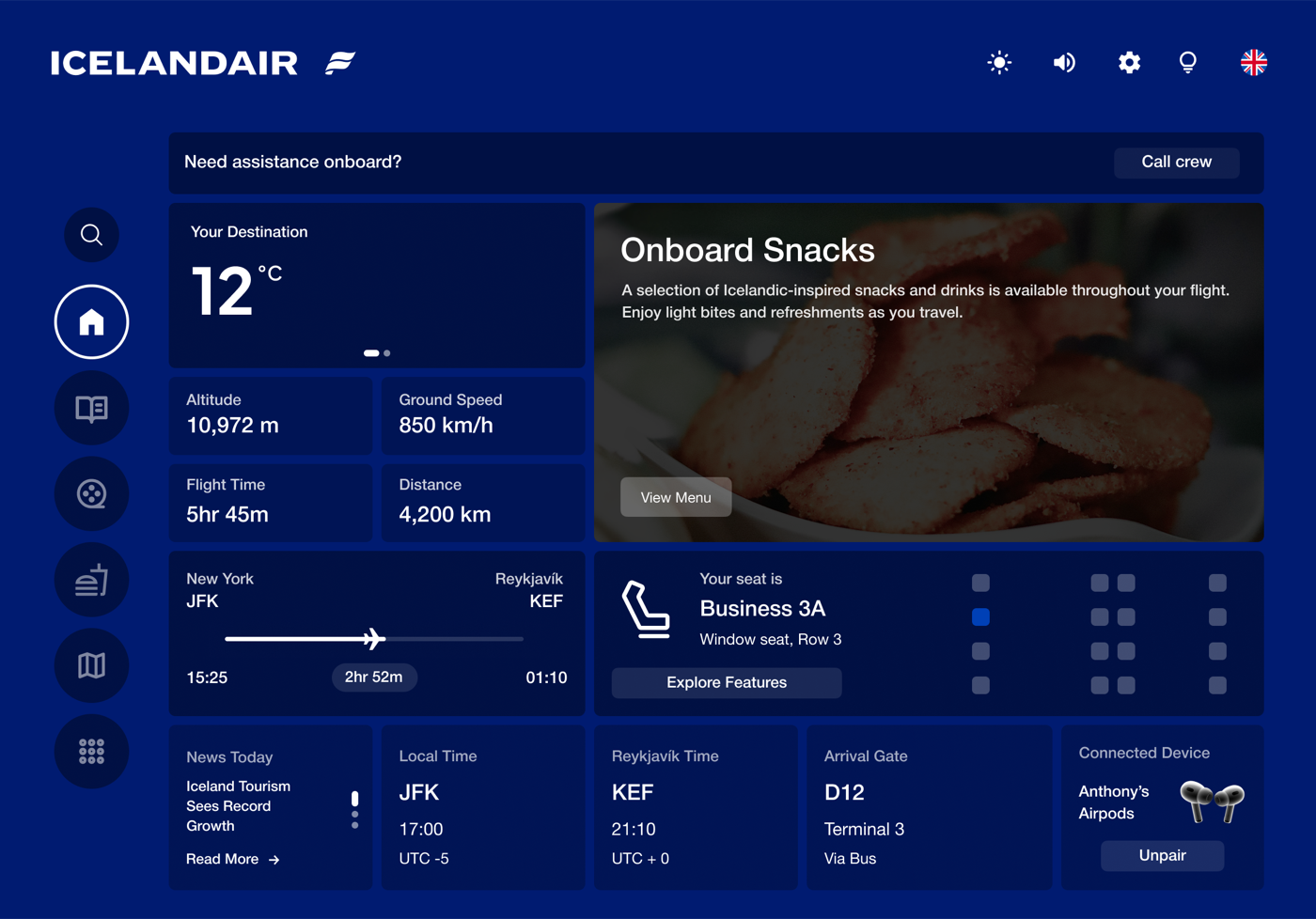
Flight progress, altitude, speed, and local time at destination — all missing from the original. The welcome screen surfaces what passengers actually want to know when they sit down.
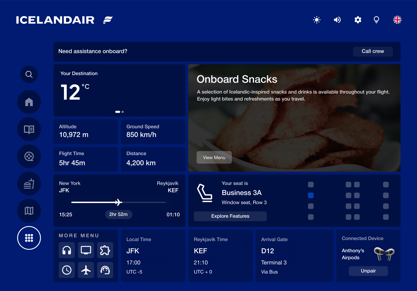
Six fixed sections replace one endless scroll. The nav bar stays persistent throughout the system — you always know where you are.
Browse the menu, customise, pay directly on screen, sent to your seat.
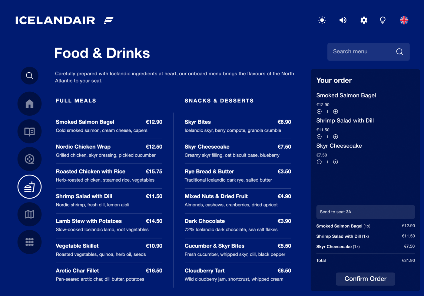
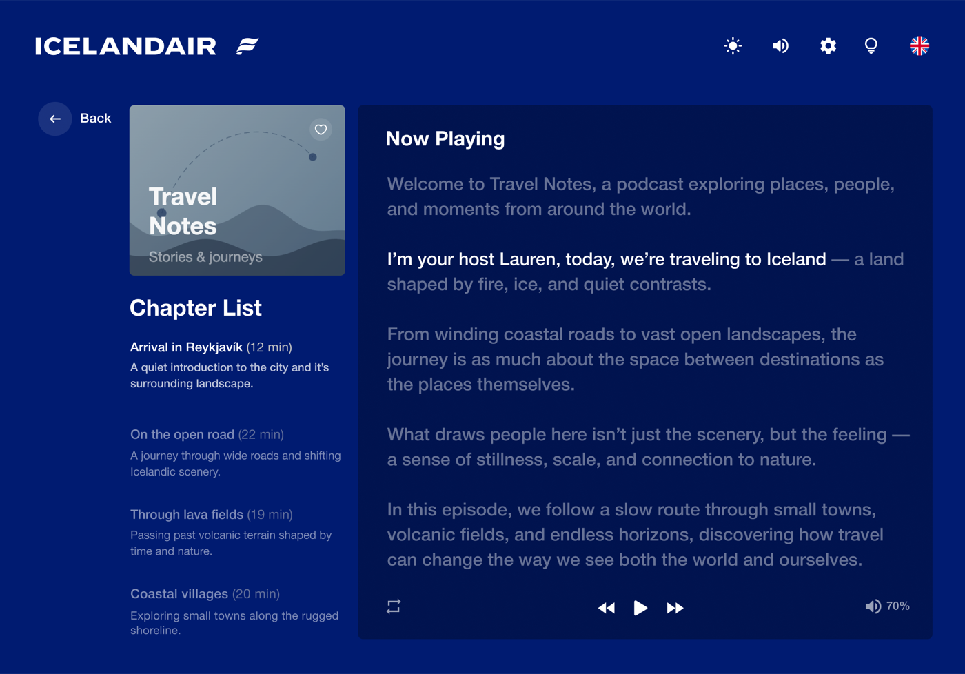
Food ordering was paper-only. Flagging a crew member on a full six-hour flight was the most-cited friction point in research. The menu leads with Icelandic dishes, not a generic airline list.
From browse to detail to playback, with subtitle and audio controls one tap away.
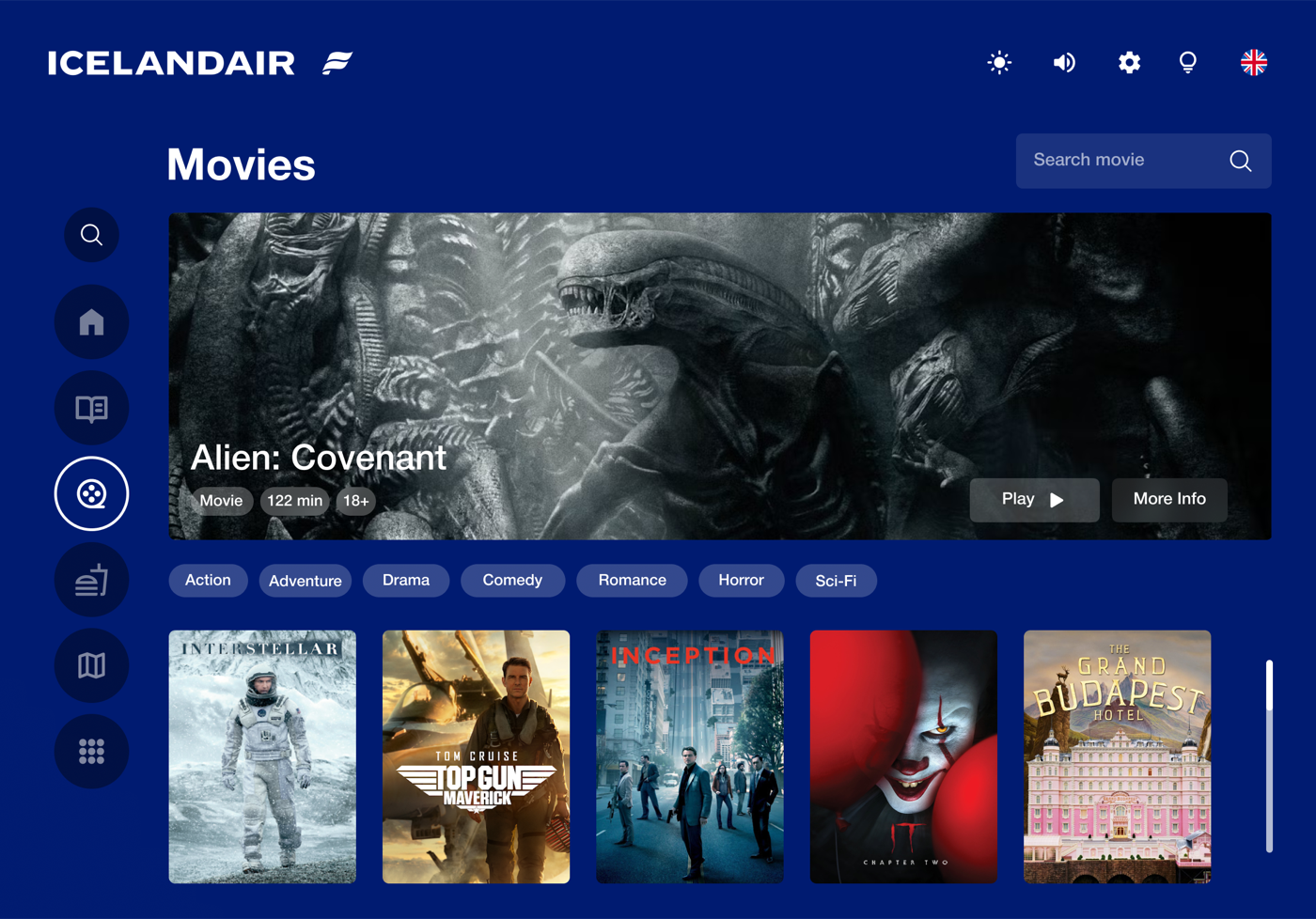
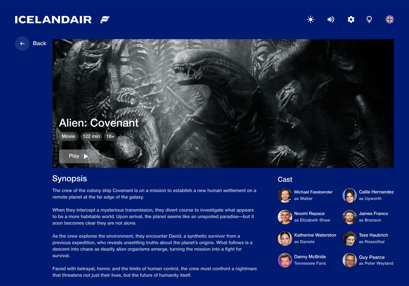
Finding a film meant scrolling the entire library with no categories and no search. Subtitle and audio controls are one tap from the player, not buried in a settings menu.
Music and podcasts in one place, down to the artist profile.
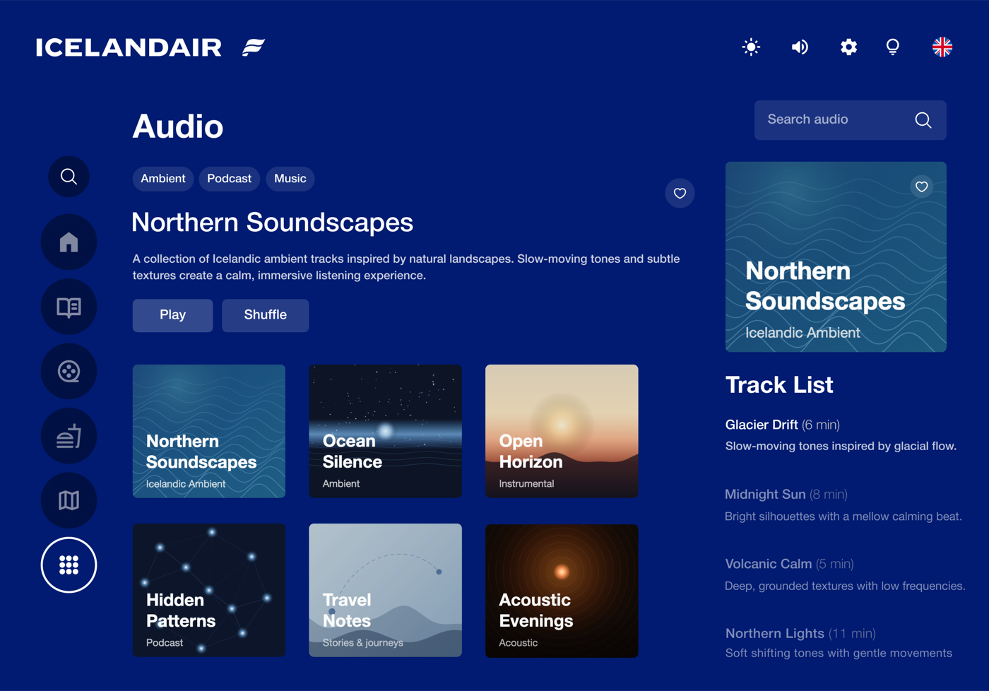
Icelandic artists and playlists surface at the top rather than buried in a global library.
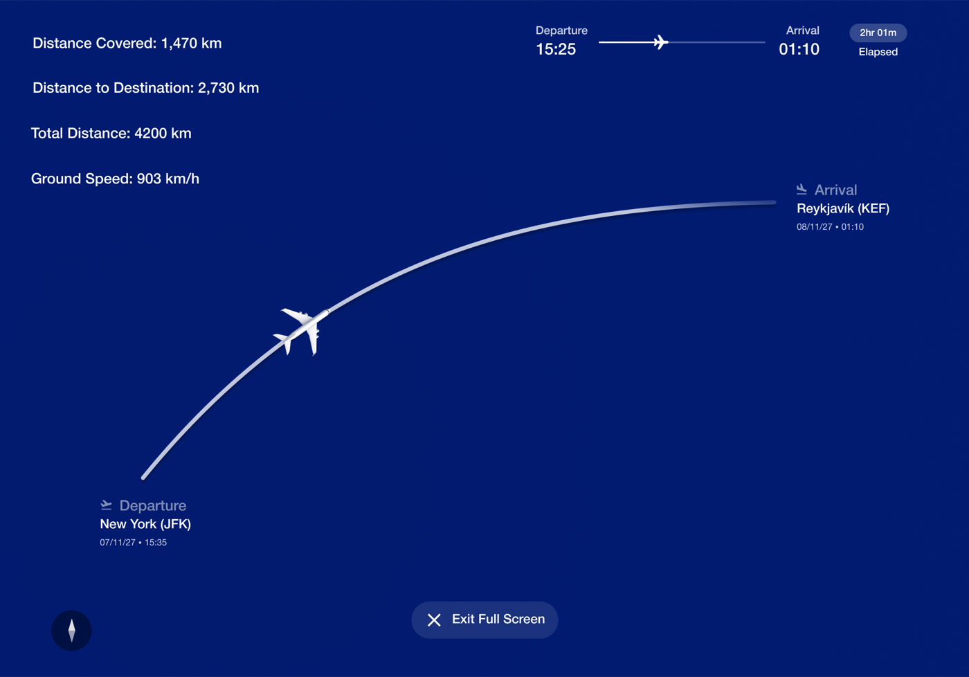
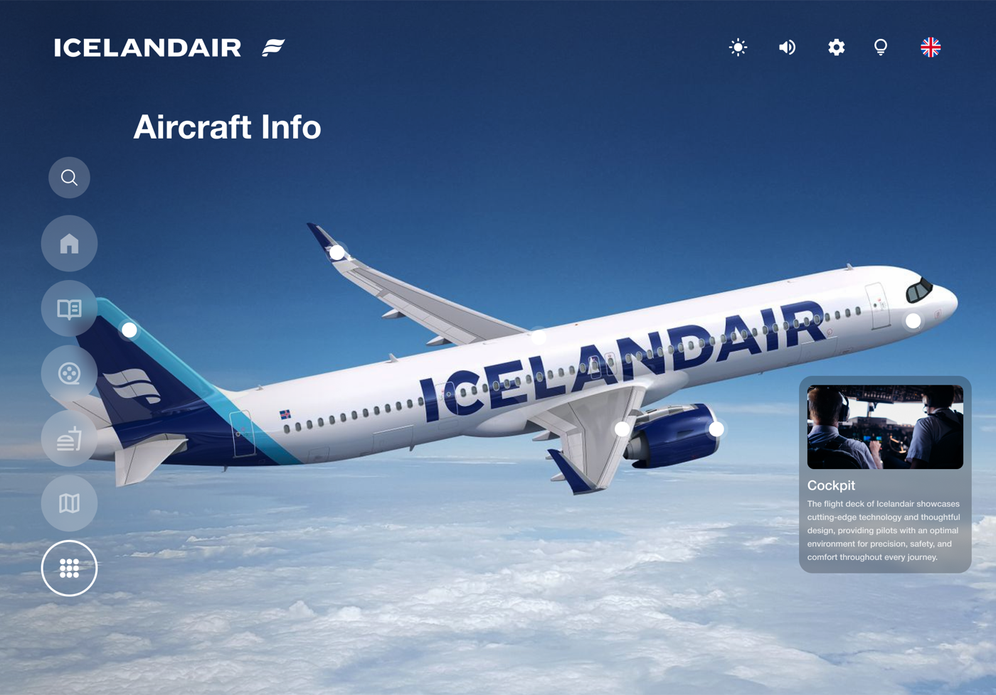
The original map was a dot on a featureless ocean. Altitude and speed are now overlaid on the arc. The 360° KEF view lets passengers explore Reykjavík before they land.
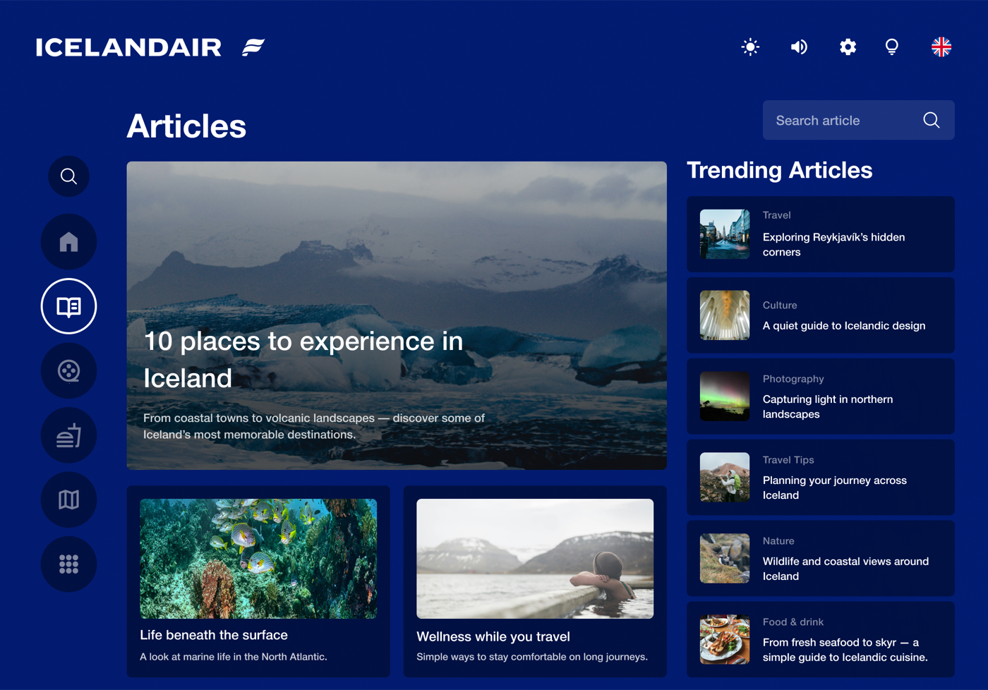
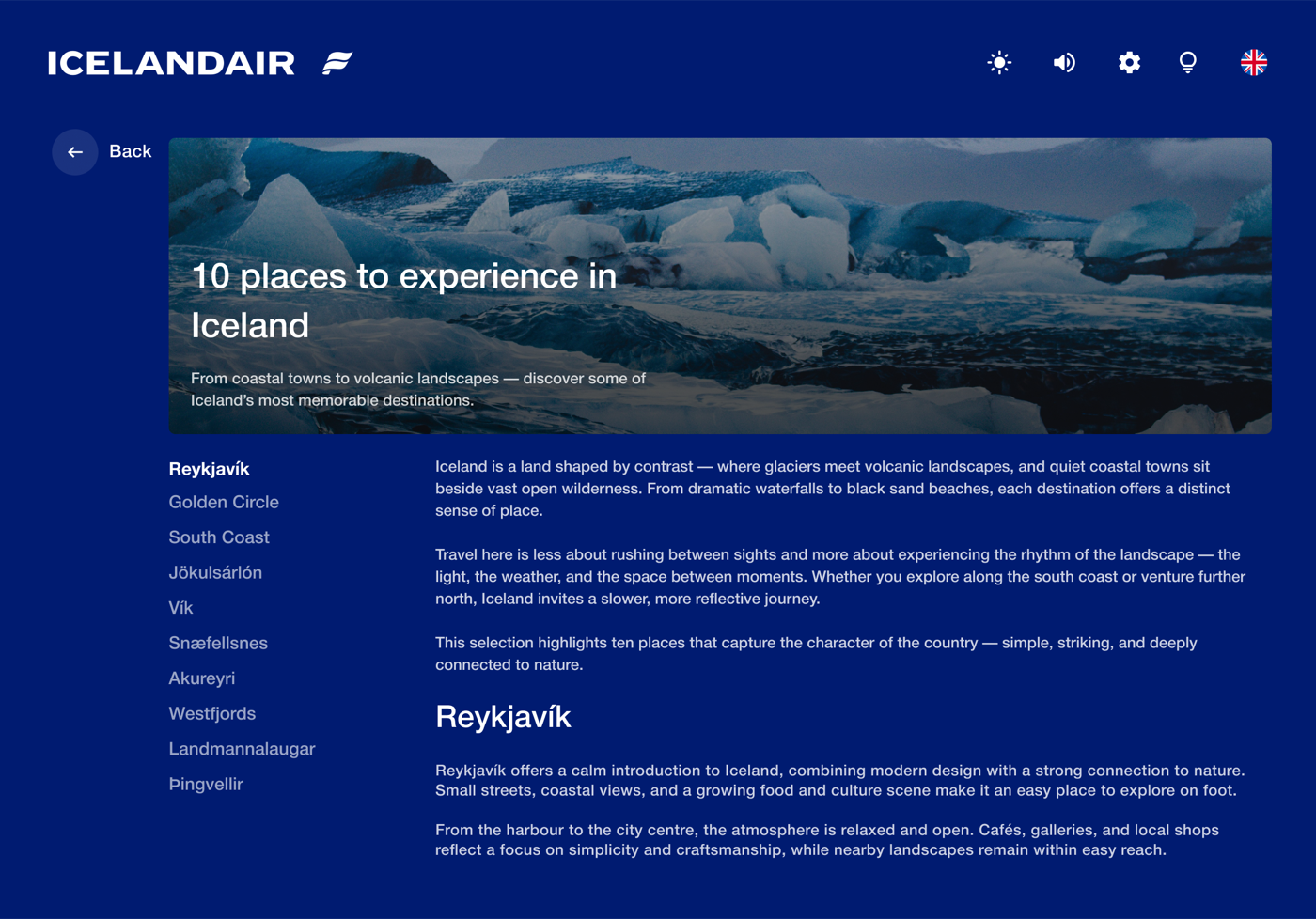
Articles about Icelandic geography, culture, and things to do — tied to where you're flying, not generic inflight filler.
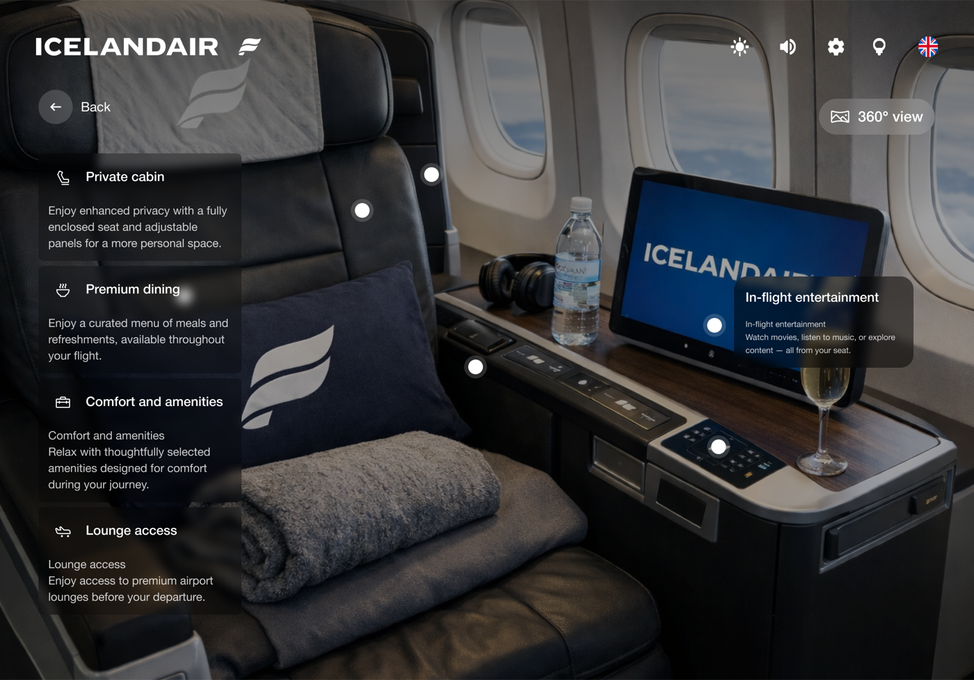
Seat controls, recline, and reading light mapped visually — so you're not feeling around in the dark at 2am or waiting for a crew member to explain it.