What I found
01
Content is hard to find
Everything — films, TV, music — lives in one undivided list. No categories, no search. I watched the passenger next to me scroll for a minute, not find what he wanted, and give up.
02
Flight data without context
Speed, altitude, time to destination — all there, but as a wall of text. No map. You're crossing the North Atlantic and the screen gives you no sense of it.
03
No food ordering on screen
A paper menu, handed out by crew, ordered verbally. Every other part of the experience is on screen — food is the obvious thing missing.
04 · worth keeping
The navy blue
The one thing that felt deliberate. Deep navy, clearly Icelandair. I kept it and built the whole visual system around it.
What I noticed in the cabin
–Several passengers scrolled for minutes before picking something, or just switched the screen off.KEF → Toronto
–With no search, finding one specific film meant scrolling the whole list. Rough late in a long flight.Toronto → KEF
–The paper menu felt disconnected from the screen. Two systems doing one job.KEF → Toronto
What the redesign focuses on
→Split content into dedicated sections so each type is easy to find.
→Added search to every section. A direct route to a title without browsing.
→Built in digital food & drink ordering with seat delivery, all in one interface.
→Made Iceland a context, not just a destination. Incorporating the country into the airline through audio, editorial, and landscape throughout the interface.
At Keflavik airport
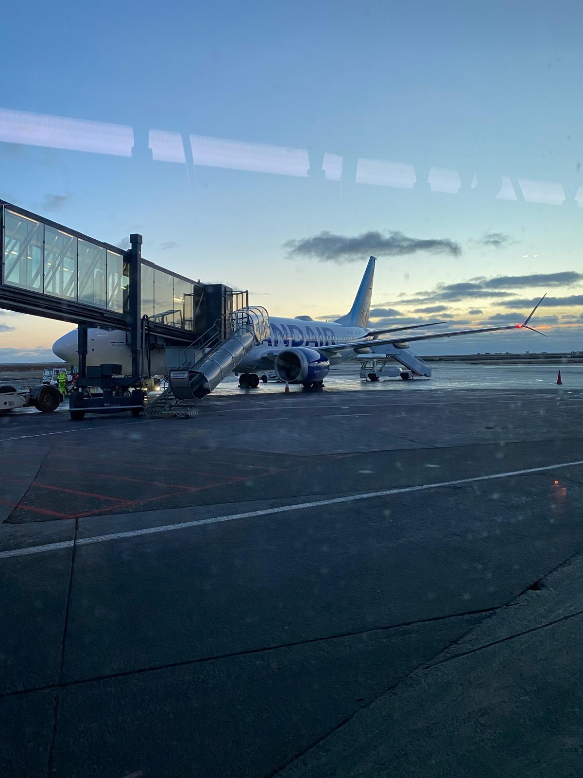
Keflavik, layover. BER → KEF → YYZ.
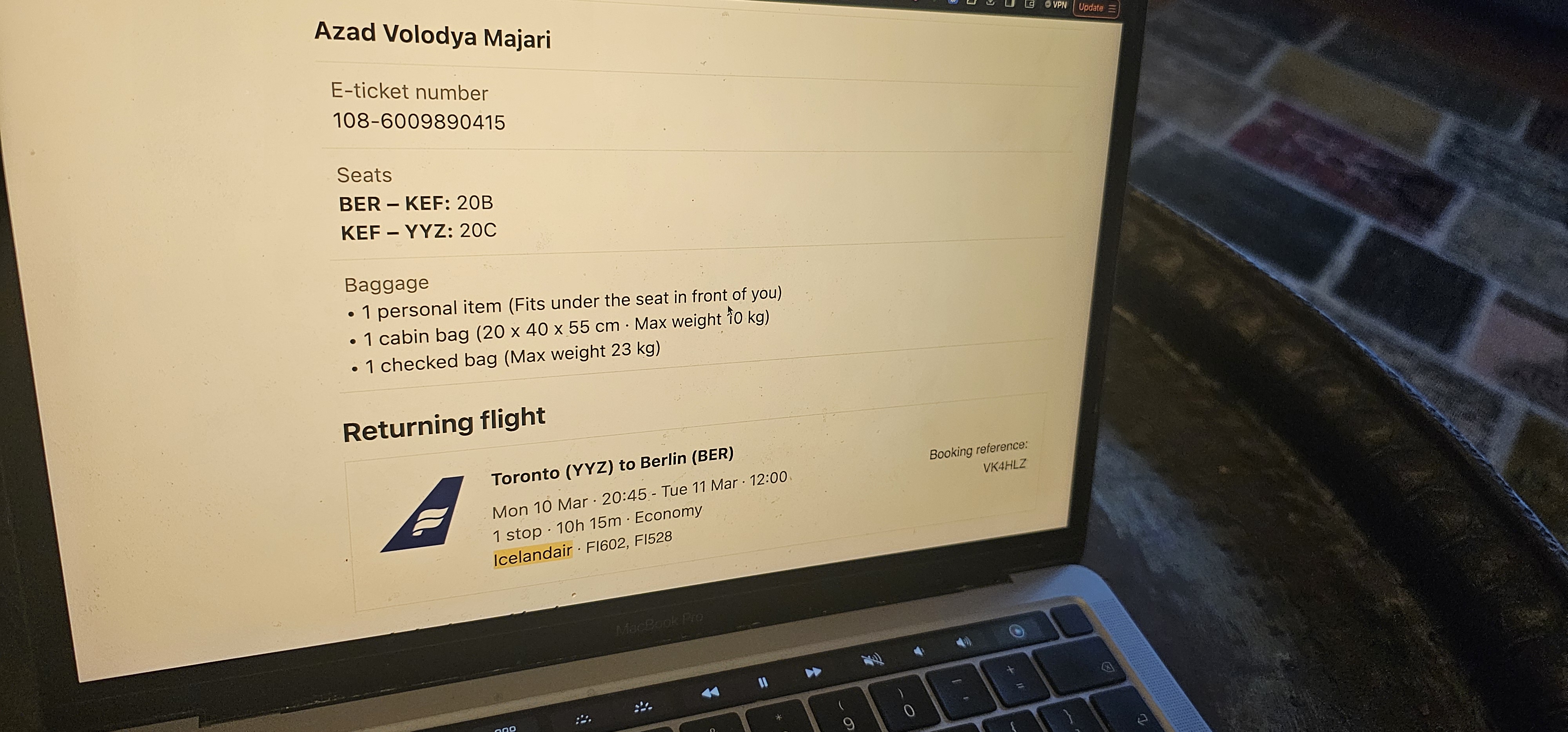
The actual ticket. Real flight, not a demo.
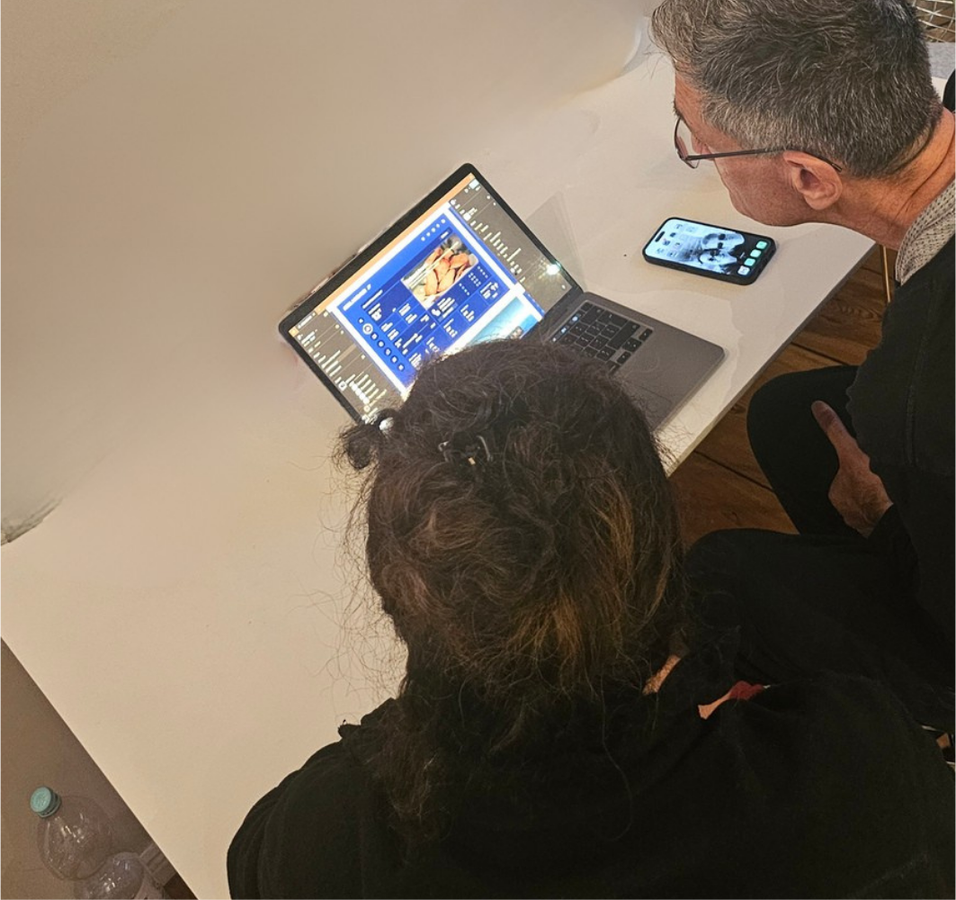
Showing the Figma designs during the layover.
→
Passengers scrolled for a minute looking for something, didn't find it, and turned the screen off. No categories, no search, no shortcut.
→
Speed and altitude on a text screen. You're crossing the North Atlantic and the IFE gives you no sense of it.
→
Paper menu, verbal order. Every passenger I spoke to assumed food ordering was already on the screen.
What the design feedback changed
→Separate sections for movies, TV, documentaries, articles and games — no more single vertical scroll.
→Food ordering built into the screen: direct to seat, online payment, no paper menu.
→Iceland brought in throughout — Icelandic audio podcasts, articles, and documentaries as a dedicated section.